Austin Crash Data
November 2025
Google Looker Studio • Python
Using Google Looker Studio and a public dataset from the city of Austin, I reproduced Austin's Vision
Zero Viewer, which visualizes traffic accidents throughout the city.
I visualized the data in four different formats: large figures along the top of the report to provide
an overview of the figures the report explores, a column chart comparing this year's data versus the
five year average, a stacked column chart showing accident trends by mode of transportation, and a map
that displays the distribution of accidents for 2025 and the severity of each accident.
This project reinforced my skills in:
- Data Cleaning – The original dataset contained over 224,000 entries. In order to create the dashboard, I had to select relevant subsets from the dataset, as well as isolate figures I needed using the .groupby() method in Pandas. I was able to perform the data wrangling in Python using about 80 lines of code.
- Data Visualization – I created the dashboard using Google Looker Studio. In order to allow users to filter the data in the visuals, I was challenged to develop advanced formulas to create the dropdown menus. I also wrote formulas to generate the geographical data needed to create the map visualization.
Congressional Seats
October 2025
Webscraping • Python


To visualize how party lines have evolved over time in the United States, I developed a tool to
webscrape Wikipedia (Party Divisions of United States Congresses).
I used the data I retrieved through webscraping to create two pairs of charts: one showing the total
count of seats over time, which gave a great visual of America's growth over its 250 year history,
and another showing the percent share of seats, which gave an idea of which party held power in each
congress.
This project reinforced my skills in:
- Data Collection – I created a headless browser using Selenium in order to access Wikipedia. With BeautifulSoup, I extracted the HTML table data from Wikipedia and converted it to a Pandas DataFrame.
- Data Cleaning – The table data I extracted directly from Wikipedia was complex and filled with annotations. I systematically split the data by congress and party, then removed annotations to preserve the numerical data.
- Data Visualization – I created the final images by importing the cleaned data to Microsoft Excel, where I generated two styles of column charts.
- Python Programming – This project required extensive work with Pandas DataFrames. The final program had a little over two hundred lines of code.
Weather Dashboard
September 2025
Rest APIs • Python
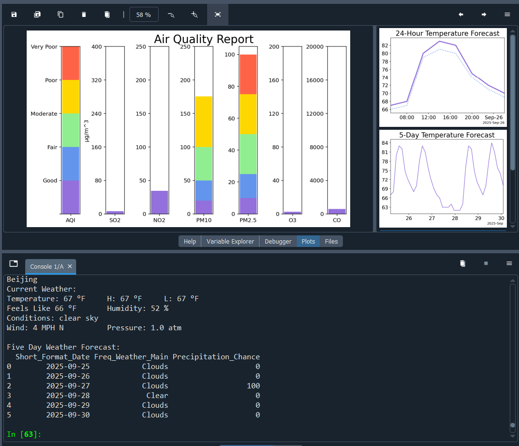


Using OpenWeather's free API service, I wrote the framework for a weather dashboard in Python.
I parsed the data from json format to collect current weather data including temperature, high and
low temperatures, feels like temperature, humidity, wind speed and direction, air pressure, and a
brief qualitiative description of weather conditions. I also collected a five-day weather forecast
and used the data to plot temperature with feels like temperature at a 24 hour scale, temperature at
a 120 hour scale, and to build a table detailing predicted weather conditions and precipitation
chance. Next I collected air quality data, including concentrations for pollutants and particulates,
and generated a color-coded Air Quality Report dashboard.
This project reinforced my skills in:
- Data Collection – I used four different APIs to gather all needed data. In order to extract the data I needed, I had to work with json files, Pandas DataFrames, and dictionaries.
- Data Visualization – I worked extensively with the Matplotlib Python library. The 24-hour and 120-hour temperature forecasts used line plots. The Air Quality Report used bar charts to display index and air component levels.
- Python Programming – Generating the reports required several complex functions, such as my "get_stacks" function, which wa snecessary to create the color-coded bands for the Air Quality Report, as well as the use of several libraries. The final program had nearly five hundred lines of code.